Here are my final evaluative comments on this personal project. I have split this into the following sections:
1. Evaluation of the prototype and how it could be improved. (good points, bad points, improvements)
2. A SWOT analysis of myself with comments on how I could improve my working practice.
3. A list of technical problems that I overcame.
4. Thoughts on how this personal project could help or influence my MA project.
1. Evaluation of the prototype and how it could be improved. (good points, bad points, improvements)
I feel the prototype works well as a demonstrator overall. It is interesting to view/use and will keep the users attention with this prototype/demonstrator providing about 10 minutes worth of interaction. However it could be improved in various ways as well to do with the Interface and the animation footage. I also feel that the Rotoscoping idea and use was very appropriate to the concept and although time consuming it as enabled a sophisticated animation and feel to the project. Also the areas in which this idea/prototype could be taken into are vast really. This is due to the strength of the idea/concept (the golden ratio/shell idea). I feel good research and creative thinking have combined to produce/suggest an innovative idea with good legs and potential for development. Overall I'm very pleased with the outcome.
Good Points:
a. A good/innovative idea/concept with lots of potential. Also the way it could be developed into different routes such as immersive and networked solutions/ideas.
b. Development of the idea, themes related to the golden ratio and fibonaci numbers etc related to timings of clips and ratios of size etc is strong and imaginative.
c. The Rotoscoping effect/technique works well with and is appropriate to the idea and themes. Very effective animations.
d. Animations work well considering time constraints to suggest to viewer dark, light and irrational/rational thoughts. Good use of animation ideas such as: metamorphosis, condensation, synecdoche, symbolism and metaphor,associative relations and sound effects which all work to create different moods, feelings, intrigue, tension, atmospheres etc.
e. A clear and usable interface with effective navigation, good use of structure and grid system.
f. Narrative structure is interesting and works reasonable well so to give the viewer choices and clear/simple choices.
g. The simplicity and clarity of the Interface which I feel benefits the balance between playful interaction and usability is good. Clear/playful effective navigation device of the characters heads related to light/dark areas/thoughts etc
h. Good use of colour, black/white, shades of grey and then just flashes of reds and yellow is effective and helps the uniformity of the good visual appearence of the interface.
i. Good use of clear instructions.
Bad Points:
a. Animations are a little too short and maybe if I had more time I could have chosen higher numbers in the Fibonaci range so to make the animations more effective in terms of creating ambience, intrigue and tension. However i did recognise constraints and came to a compromise which does work.
b.The use of sound within the Interface design could be more inventive and effective such as use of prompts etc related to accessibility issues.
c. The action scripting could be more effective within the Flash file, but it does work and there are no error messages.
d. Maybe this should be uploaded onto a dvd or online to further test protype. However it is designed in Flash to be flexible and I'm not sure what is the appropriate deliverable for this product at present. It needs some market research to be completed before it could be taken further.
e. I could have added more a/v controls etc in interface for users, but I have tried to keep it as simple as possible, so there are pros and cons.
f. Rotoscoping technique was very time consuming and ambitious. Is it worth it? Could i have developed a more simple technique?
g. I have solved many problems with this, but there are still 1 or 2 little problems with the video footage and actionscript etc etc which could be refined.
Improvements:
a. Add more / refine sounds within the interface so to help with accessibility and ambience of the product.
b. Make the animations longer so to add more intrigue, understanding and tension within the narrative.
c. More inventive / playful interaction could be used.
d. Refine actionscript.
2. A SWOT analysis of myself with comments on how I could improve my working practice.
STRENGTHS:
a. Good use of web 2.0 resources so to help me document process and research (blogs, delicious etc).
b. Good thoughtful/reflective approach/attitude - wanting to improve and take further.
c. Good skills in graphic design and software such as photoshop and drawing skills which helped with the rotoscoping and visual design of Interface.
d. I have planned my time and made good decisions in terms of the development of this project. I have recognised my strengths and weaknesses and produced things accordingly and I dont think it as been detremental to the original idea/concept.
e. I'm very organised - I have to be because I'm working full-time as a teacher as well as completing this course.
WEAKNESSES:
a. Not much experence using Flash software - limited action scripting skills/knowledge, but it is improving and this project as developed my skills and understanding further.
b. Having to develop a lot of skills and knowledge in a short space of time. Some of the learning curves have been steep.
OPPORTUNITIES:
a. Tutorial support from University with Flash etc and good email support, which helped me greatly.
b. I've enjoyed the lectures and exploring theory related to areas such as Interactive film and narrative and usability. I feel I have learnt a lot and I have developed as a professional person in this area.
THREATS:
a. Over the past year I have had a couple of health problems which I have now overcome, but did take up time and effort.
b. My computer's power pack blew up in December, so I went 5 weeks without a computer at the start of this term which did not help. I learnt the hard way in terms of lost work which was not backed up! Now I have an external hard drive etc.
c. I live 50 miles away from Bath so it is a struggle coming in sometimes, but my attendance and punctuality is good, I have found email support helpful.
d. I work full-time in a time consuming and professional job, so I have had to manage my time well. This I have found dissapointing because I do feel I could do better or enjoy more my studies etc if I could have completed this project full-time rather than part-time. However I have done reasonably well.
e. Lack of programming skills/background.
3. A list of technical problems that I overcame.
I started this project exploring various software and techniques such as motion typography in Motion and Flash, moving image exploration with film, animation and sound in QuickTime and Final Cut Pro etc. I did learn various techniques and processes in the software which helped my overall undestanding of what I was doing. I then made some good choices related to the project ideas/themes etc to use a rotoscoping technique in Flash. Through reading, tutorials etc I used layers in Flash to draw frame by frame, but to make it less time consuming I only brought into Flash the qt movies at 12 fps and matched it to the Flash settings which helped. I did a lot of playing around with the Flash settings so to get the correct balance between memory size and quality etc. I picked up some good rotoscoping ideas and working proceses by watching the making of 'A Scanner Dakly' which helped me improve the quality of and the making time of the animations. So the software I used were:
Flash 8 (actionscript 1,2)
QuickTime Pro
Sound track Pro
FireWorks 8
(original film footage was edited/created in) Final Cut Pro
I found this software worked well together and enabled me to do what I wanted effectively. With all the software I played around with the settings and problem solved/explored thoroughly. The more tricky problem solving was with Flash action script where I overcame a few problems with movie clip sound (event and sync sound), sounds playing and stopping, and few other things. I did problem solve successfully and I disregarded more complex interaction such as drag and drop, and slider bar interaction which I have now successfully got working, in favour of more simple interaction which I felt was more appropriate for this project. Keep it Simple so that the user is not confused with too much complexity and pointless options. I'm pleased with my outcomes because I feel I have achieved this to some extent.
Hardware:
Apple Mac G5 running OS X Tiger 10.4
4. Thoughts on how this personal project could help or influence my MA project.
This project as improved my Flash skills and introduced me to other areas such as interactive film which I wish to explore with my MA project. Also I have looked at ideas related to networked, immersive and locative solutions to problems which I wish to explore further.
What I have learnt though and what I think is important for the MA project is that I fully decide on deliverables and outcomes early on in the project and work towards completing them with more focus maybe than this project, because I was changing my mind a lot and changing the outcomes. Which I guess was appropriate for the project, but for my MA one, bearing in mind time constraints it needs to be well planned.
I think I need to choose outcomes etc that do not contain too much extended / eloborative / complex sripting/programming.
Play to my strengths not my weaknesses,, however I would like to improve/overcome my weaknesses as well.
Also I need to choose something which will keep me motivated and interested as well as being imaginative and innovative.
Something which will extend my skills and understanding even more. However I feel the user is the most important element in interactive design and media and whatever I design/create must have this in mind. Simple, usable, exciting interaction that works and as the user at the centre of its thinking.
Please look at more evaluative comments in this blog and in sketchbook.
Sunday, June 10, 2007
Reflective/Evaluative comments for other Projects.
Throughout this Blog are evaluative and descriptive comments regarding the development of this personal project.
Please also refer to sketchbook for assessment.
For reflective/descriptive/evaluative comments relating to the Group projects. Please refer to links:
'Group Project' (Usability group project)
'7DeadlySins Group Project' (my own comments regarding the development of the Imagined worlds brief and Installation).
For this personal project.
The blog and sketchbook are the learning log and reflective evaluation.
For the two group projects.
The blog for each project is the learning log which also contains evaluative/reflective comments and also there is a final evaluation of the project, product and myself on each blog for each project.
Info and other ideas
As part of the prototype I have developed some intial ideas and visuals regarding how this could be taken into other areas, but also giving the viewer information and basic help etc as follows:
Info and Help

"This is an interactive film/animation which allows the viewer/user to make choices which
determine the advance of the narrative. This is only a prototype and concentrates on
Scene 4 of the film. The footage and scenes are based on the film 'The Conversation'
and the idea is to see and hear the thoughts of the two characters within that film as
they are speaking to each other. Therefore this is 'The Thoughts'.
This is a prototype which could be developed further for a range of deliverables including
online, mobile/augmented and immersive installation solutions.
Follow the white commands on screen to advance the film and navigate the interface
through using the dark grey buttons/words (back) and the character's heads".
Narrative Structure

"'The Thoughts' is based on a shell like narrative structure (influenced by the Golden
Ratio/Fibonaci numbers, the idea and ratio behind how things grow in nature). Using this
idea related to how thoughts grow in the mind when you are having a conversation or
thinking about what to say or how to respond. This is also related to the length and size of
the animated/film clips.
So the viewer/user will have 3 choices to advance the narrative: a. dark irrational
thoughts, b. light irrational thoughts and c. more rational developed thoughts.
Representing the growth of both the character's thoughts through their conversation.
The Interface structure and base of the animation structure is based on a 'tree structure'.
The animations also use/based on a 'Golden Ratio shell structure'. This as been influenced
by Robert Coover's 'electron shell' structure which enables interpretation and viewpoint
choices".
Network Idea

"I also think this prototype as potential to be pushed into a social network/online
communication/community route. This could combine the use of a form or php script
linked to a database which enables viewers to upload/send their thoughts to 'The Thoughts'
so to change/adapt the narrative in a networked way, with friends/other viewers".
Immersive Idea

"The prototype could be taken into an Immersive installation route where user's/viewer's
could walk into a space where they interact with large screens or projections on surfaces.
Maybe like entering the characters minds, seeing their thoughts and interacting in some way.
One idea I have is that the viewer could interact by where he/she stands in the space.
Triggering animations and sounds in a locative way with interactive pads on the floor.
This could be taken further in terms of a space which senses how you are feeling/what you
are thinking and then feeds back to you via sounds and animations - seeing your thoughts.
You could play with distances and space related to the Golden Ratio etc".
Info and Help

"This is an interactive film/animation which allows the viewer/user to make choices which
determine the advance of the narrative. This is only a prototype and concentrates on
Scene 4 of the film. The footage and scenes are based on the film 'The Conversation'
and the idea is to see and hear the thoughts of the two characters within that film as
they are speaking to each other. Therefore this is 'The Thoughts'.
This is a prototype which could be developed further for a range of deliverables including
online, mobile/augmented and immersive installation solutions.
Follow the white commands on screen to advance the film and navigate the interface
through using the dark grey buttons/words (back) and the character's heads".
Narrative Structure

"'The Thoughts' is based on a shell like narrative structure (influenced by the Golden
Ratio/Fibonaci numbers, the idea and ratio behind how things grow in nature). Using this
idea related to how thoughts grow in the mind when you are having a conversation or
thinking about what to say or how to respond. This is also related to the length and size of
the animated/film clips.
So the viewer/user will have 3 choices to advance the narrative: a. dark irrational
thoughts, b. light irrational thoughts and c. more rational developed thoughts.
Representing the growth of both the character's thoughts through their conversation.
The Interface structure and base of the animation structure is based on a 'tree structure'.
The animations also use/based on a 'Golden Ratio shell structure'. This as been influenced
by Robert Coover's 'electron shell' structure which enables interpretation and viewpoint
choices".
Network Idea

"I also think this prototype as potential to be pushed into a social network/online
communication/community route. This could combine the use of a form or php script
linked to a database which enables viewers to upload/send their thoughts to 'The Thoughts'
so to change/adapt the narrative in a networked way, with friends/other viewers".
Immersive Idea

"The prototype could be taken into an Immersive installation route where user's/viewer's
could walk into a space where they interact with large screens or projections on surfaces.
Maybe like entering the characters minds, seeing their thoughts and interacting in some way.
One idea I have is that the viewer could interact by where he/she stands in the space.
Triggering animations and sounds in a locative way with interactive pads on the floor.
This could be taken further in terms of a space which senses how you are feeling/what you
are thinking and then feeds back to you via sounds and animations - seeing your thoughts.
You could play with distances and space related to the Golden Ratio etc".
Final Interface Design for the protoype 'The Thoughts'
I have now completed the working prototype for Scene 4 of 'The Thoughts'. I think it is an effective interface and prototype which gets the idea/feel across of this interactive narrative/film/animation. The interface as gone through a couple of versions and I now feel it's got structure and is clear/easy to use and navigate for the viewer/user. I would have liked to be a little more innovative with the interface/navigation and usability. However it is about getting a balance so that the product offers some playful innovation/experience ( using the characters heads as hotspots etc ) and being user freindly/easy to use.
To help with the structure of the interface pages/sections I have used a basic grid system so to add structure and uniformity, so everything looks like it belongs together and is structured. I have a background in Editorial Design, so I'm aware of the use of Grids for print based work. I feel in any graphic design work they are useful and I feel on this project it as helped.
I want to also explore the use of grid systems or concepts within moving image and multi-media, because I think there is potential for some interesting ideas and visual solutions to certain timebased/motion problems. I have been reading a book/theory on this by 'Tanja Diezmann' and 'Tobias Gremmier' titled 'Grids for the Dynamic Image', published by AVA/Academia. Really looking at the potential of using 2D, 3D, 4D grid systems.
I have taken advice from sessions regarding usability, accessibilty and the display of information on screens etc and tried to put into practice on this project, which i think as worked well and highlights my understanding so far.
One area I would like to explore further is the use of sound in Interface Design which i feel as got vast potential especially related to accessibility and the users experience.
Here are the completed Interface Design screen grabs:


Sunday, May 20, 2007
More Influences and reflective comments
I'm thinking about moving the prototype into other directions other than just an online film, such as an interactive immersive environment. I feel this is something which could be explored and 'The Thoughts' could be a good vehicle for this. I've been looking at Martin's work (website under my delicious) and I like this idea of interacting with spaces and the sculptural feel to his work. Its not just video art its about communicating and interacting with space, characters and the viewer as choices and is part of the work in a way. This I'm finding really interesting and I will explore this through 'The Thoughts' as well.
When I was in New York earlier in the year I came across two things amongst many which have inspired me in terms of how video work could develop in an immersive environment. The first being and exhibition of Bill Viola's work at MoMA ( Museum of Modern Art). A piece called 'Stations' (1994) which showed bodies submerged in water hanging, suspended in space on three giant screens, and below the screens reflections were projected onto granite polished slabs on the floor beneath each screen. It was very effective and emotive especially with the use sound (water, splashing etc). I feel I could experiment in this way with video, animation, surfaces and space with 'The Thoughts' maybe with the different choices on different screens, but adding more complexity and scale representing the characters thoughts as they grow and develop. The use of reflections I find could have some milege in terms of what you see or what you think you see.

The second use of video in and immersive environment was at the Rockerfeller Centre 'The Top of The Rock' tower. In a commercial setting video was used on different curved screens playing different camera angles and shots of footage showing you an history of the area etc. This was really effective and it was also used to direct you through to the elevators. When you were in the elevatore shooting up the so many floors more video footage was projected around the elevator and on the glass ceiling, it was very effective and awe inspiring. When you got to the top of the rock the views were stunning, but also there was an interactive display by'Apple' where in the room/area waiting for the elevators was animated projections on every surface, walls, floors,ceiling etc. If you touched certain areas doors would open, sounds were created different abstract shapes and colours came into view. Again it was an amazing use of interactive, immersive space yet also quite confusing. I kept wondering whether anyone got stuck in the room wondering what the hell was going on. Again I have been influenced by this idea of projecting images on different surfaces to add meaning or make the viewer feel a certain way or something. I think it is important to get this idea clear that everyone will have a unique experience and everyone's thoughts will be unique and could interact with 'The Thoughts' in a unique way.


I will show some visuals of how the prototype could work in this way.
When I was in New York earlier in the year I came across two things amongst many which have inspired me in terms of how video work could develop in an immersive environment. The first being and exhibition of Bill Viola's work at MoMA ( Museum of Modern Art). A piece called 'Stations' (1994) which showed bodies submerged in water hanging, suspended in space on three giant screens, and below the screens reflections were projected onto granite polished slabs on the floor beneath each screen. It was very effective and emotive especially with the use sound (water, splashing etc). I feel I could experiment in this way with video, animation, surfaces and space with 'The Thoughts' maybe with the different choices on different screens, but adding more complexity and scale representing the characters thoughts as they grow and develop. The use of reflections I find could have some milege in terms of what you see or what you think you see.

The second use of video in and immersive environment was at the Rockerfeller Centre 'The Top of The Rock' tower. In a commercial setting video was used on different curved screens playing different camera angles and shots of footage showing you an history of the area etc. This was really effective and it was also used to direct you through to the elevators. When you were in the elevatore shooting up the so many floors more video footage was projected around the elevator and on the glass ceiling, it was very effective and awe inspiring. When you got to the top of the rock the views were stunning, but also there was an interactive display by'Apple' where in the room/area waiting for the elevators was animated projections on every surface, walls, floors,ceiling etc. If you touched certain areas doors would open, sounds were created different abstract shapes and colours came into view. Again it was an amazing use of interactive, immersive space yet also quite confusing. I kept wondering whether anyone got stuck in the room wondering what the hell was going on. Again I have been influenced by this idea of projecting images on different surfaces to add meaning or make the viewer feel a certain way or something. I think it is important to get this idea clear that everyone will have a unique experience and everyone's thoughts will be unique and could interact with 'The Thoughts' in a unique way.


I will show some visuals of how the prototype could work in this way.
Development so far
I've now got to the stage where the animations and interface are nearly completed , just a few tweaks here and there.
I've decided I will hand this in as a prototype on DVD getting across the idea of the interactive film. I'm also going to show the following in the help section of the interface: a, visual showing the narrative structure, b, visuals showing how it could work in terms of online community communication, c, visuals showing how it could work in an interactive environment. So over the next week i will refine everything and post the swf file and screen grabs on here. With the problems I've had and with work committments etc, I'm really pleased with the prototype so far, and with more time I feel this could be developed as my MA project, but I also have other ideas as well.
I've decided I will hand this in as a prototype on DVD getting across the idea of the interactive film. I'm also going to show the following in the help section of the interface: a, visual showing the narrative structure, b, visuals showing how it could work in terms of online community communication, c, visuals showing how it could work in an interactive environment. So over the next week i will refine everything and post the swf file and screen grabs on here. With the problems I've had and with work committments etc, I'm really pleased with the prototype so far, and with more time I feel this could be developed as my MA project, but I also have other ideas as well.
Tuesday, May 01, 2007
Development of Animations
Here are a few screen shots of my Flash Animations which are still being developed alongside the Interface Design.
A series of three animations which are also joined together to make the complete scene (scene 4).
1. 5 second clip (irrational dark nightmare thoughts)
2. 8 second clip (irrational dreamlike thoughts)
3. 13 second clip (more rational realistic thoughts)
Its taking time doing the Rotoscoping, but I am getting there. I will start to add motion typography and sound over the next few weeks so to make the animations more rich and developed.
Within the animations I'm exploring various metaphors and symbolism (imagery and movement) related to the couples relationship and the script from 'The Conversation' scene 4. Playing around with their thoughts, giving the viewer 3 options/choices to move the narrative on as above.
Clip1:


Clip2:


Clip3:


A series of three animations which are also joined together to make the complete scene (scene 4).
1. 5 second clip (irrational dark nightmare thoughts)
2. 8 second clip (irrational dreamlike thoughts)
3. 13 second clip (more rational realistic thoughts)
Its taking time doing the Rotoscoping, but I am getting there. I will start to add motion typography and sound over the next few weeks so to make the animations more rich and developed.
Within the animations I'm exploring various metaphors and symbolism (imagery and movement) related to the couples relationship and the script from 'The Conversation' scene 4. Playing around with their thoughts, giving the viewer 3 options/choices to move the narrative on as above.
Clip1:


Clip2:


Clip3:


Friday, April 13, 2007
Some thoughts on how "The Thoughts" could be developed
I've been thinking about how this interactive product could be developed or taken further at a later stage. One idea I've been looking into and experiencing on the net is the idea of an interactive community. Where different users across the world wide web could communicate and interact in various ways. Three examples I have viewed and evaluated to some extent are listed below with my thoughts.
1. 7 Years Later - interactive film advertisement which as a community area where users/creators can upload and exchange their own versions of the film to others, which I find interesting and useful on various levels in terms of communication and interaction.
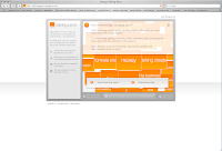
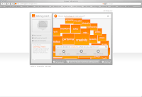
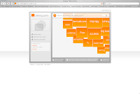
2. Orange Talking Point site where you can vote for a word and voice your oppinions and try to interact with Orange and shape their views etc. This like above is a commercial idea to get people involved and to get email addresses and new customers eventually. Maybe a bit of a marketing gimmick to some extent. However the technology and simplicity of the idea is great and again its something that gets the user involved and interacting/communicating in an interesting innovative way.
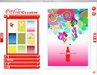
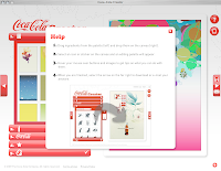
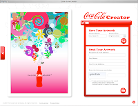
3. Coke Creator site which allows you to create your own Coke poster. From a creative and educational viewpoint this is a great way again to get people involved and to develop skills etc. Like above it is about this Generation Content marketing idea - getting consumers to produce content for the Brand, therefore developing a relationship with the Brand etc etc. It contains great working, usable, dynamic, intuitive and fluid interaction. You have the option to upload and send your poster, which could be interesting in terms of evaluating work etc as well.


The sites are bookmarked on my Del.icio.us.
In terms of "The Thoughts". It could be developed with options for the users/viewers to upload their own thoughts to the narrative/animations and therefore changing the sequences or advancing the narrative etc, or more simply adding evaluative comments about the film etc. This is food for thought, but I would have to develop my php/database skills a lot more or employ someone to do this.
1. 7 Years Later - interactive film advertisement which as a community area where users/creators can upload and exchange their own versions of the film to others, which I find interesting and useful on various levels in terms of communication and interaction.
2. Orange Talking Point site where you can vote for a word and voice your oppinions and try to interact with Orange and shape their views etc. This like above is a commercial idea to get people involved and to get email addresses and new customers eventually. Maybe a bit of a marketing gimmick to some extent. However the technology and simplicity of the idea is great and again its something that gets the user involved and interacting/communicating in an interesting innovative way.


3. Coke Creator site which allows you to create your own Coke poster. From a creative and educational viewpoint this is a great way again to get people involved and to develop skills etc. Like above it is about this Generation Content marketing idea - getting consumers to produce content for the Brand, therefore developing a relationship with the Brand etc etc. It contains great working, usable, dynamic, intuitive and fluid interaction. You have the option to upload and send your poster, which could be interesting in terms of evaluating work etc as well.


The sites are bookmarked on my Del.icio.us.
In terms of "The Thoughts". It could be developed with options for the users/viewers to upload their own thoughts to the narrative/animations and therefore changing the sequences or advancing the narrative etc, or more simply adding evaluative comments about the film etc. This is food for thought, but I would have to develop my php/database skills a lot more or employ someone to do this.
Development of Interface Design
I have now developed the Interface in Flash keeping to and adding to my initial sketches in my sketchbook. I now have a working interactive Interface for "The Thoughts". I have been exploring actionscript and buttons/links to different scenes and building the Interface in a modular fashion within Flash so to keep down download times and to improve usability etc.
I am very happy with this so far and feel I have produced something visually stunning but also works well in terms of usability, however I will continue to refine and then test when complete in the next two weeks.
Roughs/ideas from sketchbook:


Designs so far:


I have been looking at several sites with interesting interfaces, including the "Pepsi" example below, which is visually great but is slow and not very usable. I need to develop the balance between content and functionality so that the interface and product as a wow factor visually but also as immediate and intuitive interaction and navigation. Please see my Del.icio.us bookmarks for examples of sites I've been viewing/evaluating.

This week I will explore more actionscript and develop the placeholders for the animations using the load movie function.
I am aiming to have a fully working prototype to bring into Bath Spa on May 2nd to show Martin and Graham and to test.
The animations are really only at a starting point /initial level so far (It is very time consuming). However I plan to add to them and develop over the next 6-8 weeks, so that by the hand-in they will be rich and fully developed, bearing in mind one of my influences "A Scanner Darkly" which uses the Rotoscoping technique I am exploring took a year to make with about 50 animators. So I have to be realistic with what I can achieve on my own within the timescale. I am enjoying making them though. It is very rewarding seeing things come to life.
I am very happy with this so far and feel I have produced something visually stunning but also works well in terms of usability, however I will continue to refine and then test when complete in the next two weeks.
Roughs/ideas from sketchbook:


Designs so far:


I have been looking at several sites with interesting interfaces, including the "Pepsi" example below, which is visually great but is slow and not very usable. I need to develop the balance between content and functionality so that the interface and product as a wow factor visually but also as immediate and intuitive interaction and navigation. Please see my Del.icio.us bookmarks for examples of sites I've been viewing/evaluating.

This week I will explore more actionscript and develop the placeholders for the animations using the load movie function.
I am aiming to have a fully working prototype to bring into Bath Spa on May 2nd to show Martin and Graham and to test.
The animations are really only at a starting point /initial level so far (It is very time consuming). However I plan to add to them and develop over the next 6-8 weeks, so that by the hand-in they will be rich and fully developed, bearing in mind one of my influences "A Scanner Darkly" which uses the Rotoscoping technique I am exploring took a year to make with about 50 animators. So I have to be realistic with what I can achieve on my own within the timescale. I am enjoying making them though. It is very rewarding seeing things come to life.
Development of structure/planning.
I have now put in lots of work in the past two weeks on this project. Therefore I have made a few important decisions and advances with the structure of the interactive, animation and design experience that is "The Thoughts".
First: The interface design and most of the animations will be in greyscale so that it is in keeping with "The Conversation" footage which was shot in black and white. This will help keep consistency within the appearence which I feel is important. However within parts of the animation there will be flashes of colour to add meaning, tension and intrigue etc.
Second: I have now been reviewing my past work in Flash and developing my skills and techniques. After exploring other software I have decided to adapt my deliverables somewhat and produce the Interface and Animations in Flash, although there will be some work produced in Final-Cut and Soundtrack Pro. The main SWF file (Interface) will be 800x600 pixels and 12fps, so primarily aimed at the web but also other interactive platforms as well. The animations will be separate Flash movie files which will load into place holders in the main SWF file.
I will keep with the idea of the 3 animations for this scene 4 prototype as so:
1. 5 second clip, 200x100 pixels (initial, dark, nightmarish thoughts).
2. 8 second clip, 300x200 pixels (growing, over the top, fantasy, dreamlike thoughts).
3. 13 second clip, 400x300 pixels (more developed, rational thoughts-mixed with live footage etc).
this is all keeping with earlier ideas, but more developed. Getting across the idea that thoughts develop and become more rational as they grow.
So I will hand in:
1. A complete Flash prototype concentrating on Scene 4. Handed in on CD.
2. Back-up work including my sketchbook/log and this reflective, critical blog.
3. Ideas/visuals on how this project could be taken further in terms of Interactive Design/Media.
Third: I have now completely sorted out the narrative structure of the film/animations and how everything works together (based around the shell/Golen Ratio concept). I will continue to develop this as I progress with the project keeping in mind the viewer's/user's experience. I will also use the sound from "The Conversation" plus added atmospheric soundscapes. However I will only use some of the real footage in clip 3(as above).
Here are some ideas from my sketchbook:


Monday, April 02, 2007
Development of project - progress so far

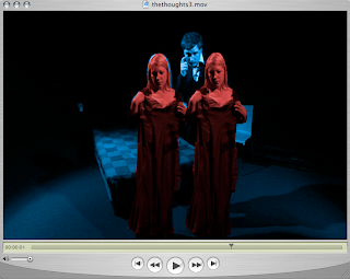
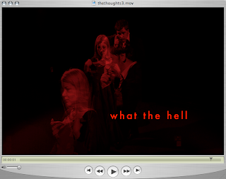
I am now progressing with this project in several ways. Firstly I have now refined and decided on the approach and content. Secondly I have started to refine the script and created mood boards and image researching for the animations. Thirdly I have started to produce the animations exploring the use of various software and ideas.
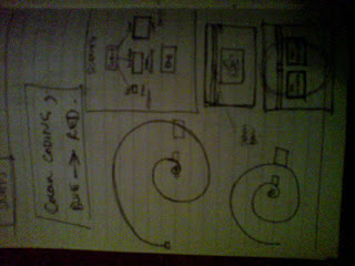
1. Approach and Content: following on from previous comments I'm going to produce a prototype which shows three options on the spiral narrative structure using scene 4 of 'The Conversation' for 'The Thoughts' as shown in sketchbook. I will design an Interface based on the animations where the screens for 'The Conversation' and 'The Thoughts' are situated and various screens come to life or in view dependent on users choices and options chosen. I've decided on some sort of colour coded slider bar for interaction. So dependent on slider bar position the appropriate animation choice and colours etc will show and play. I'm hoping for a seemless, fluid interaction and visual asethic. The size of the screens and length of the footage/animations will be determined by the Fibbonaci numbers ratio and related to a. Dark, hidden, negative, nightmarish thoughts - 13 seconds. b. In-different, unsure, maybe more real/developed thoughts similar to script for 'The Conversation' - 21 seconds. c. Positive, over the top, larger than life, fantasy, dreamlike, irrational thoughts - 34 seconds. This is to give the idea of how thoughts could grow in different ways and the user/viewer as an option to progress the narrative dependent on choices made so that the thoughts could be dark/twisted, normal rational or dreamlike and fantasist. Also suggesting that thoughts grow in this natural spiral shape and evolve as a person becomes more concious of what they are going to say, but there are still sub-concious thoughts etc and as they keep growing they become maybe more rational or more irrational. So playing with hidden feelings and thoughts and the idea of 'what you say is maybe not what you think'. I will explore this further and refine more. I want to explore syncronising both 'The Conversation' and 'The Thoughts' together so that the interaction effects both.
2. The script is now written and I have produced a couple of mood boards as shown and in sketchbook - creating a feel for the animations. I have started to collect images and ideas as so: a. slutty, ugly, dark, red, envy, vampire kiss/bite etc. b. kiss, dress, question marks, more real feel etc. c. togetherness, love hearts, erotic silohettes, dreamlike fantasy. lips, butterflies etc. I'm also going to play around with motion typography and sound design to add to the atmosphere of the animations.
3. I have explored using various software including: QuickTime, Flash, Fireworks and Motion so that the animations contains some film footage, type, rich colourful animations using a similar technique to 'Rotoshoping' (Waking Life, A Scanner Darkly etc) based on 'Rotoscoping'. I'm exploring how to build the prototype - combination of software etc. however I plan to complete the animations and interfaces over the next two weeks and then get them working in Flash for the interaction and completion.
The visuals for the animations will be a mix of techniques and experimental image making. Creating an extreme from 'The Conversation', a difference. Yet I want to create a style for them and the Interface so there is consistency in look and feel.
I want the content to evolve as thoughts do. Thoughts are about problem solving, thinking, engaging so I want the viewer to engage with the interface and animations in this way. Exploring imagination, a sense of magic. maybe the absurd, irrational, dysfunctional behaviour. Exploring dreams and reality, inner thoughts and make believe. I've read and explored Linklater's and Sabiston's techniques (direction and Rotoshoping) related to the above ideas. Also exploring and watching some Michael Gondry's films including 'The Science of Sleep' as I want to play around with scales, proportions, shapes and surreal, non real imagery. I've found and read a couple of articles in 'Sight and Sound', BFI, August 2006 related to the above.
I've also explored animated narrative structures and will explore and I have read about: Abstract and Interpretive forms which will be what I will use to suggest an imagined world an incoherent thought. The use of illogical, irrational continuities and maybe the audience will make their own interpretations of what they see. Like visions exploring dreamlike individuality. I think it should be challenging. I will also explore: synecdoche, metonymy, metamorphosis, condensation, symbolism and metaphors within the animations visuals and structure. I have read 'Understanding Animation' by Paul Wells, published by 'Routledge' to help me understand the above.
I've also looked at some animations from 'RESFEST 2006' to help me with influences and inspiration including a Nada Surf video 'Blankest Year' by Kristian Davidek and Verena Soltiz which explores the use of silohettes which I found interesting and others to do with layering imagery which is related to maybe layers of thoughts, the darkest being well hidden.
Subscribe to:
Posts (Atom)
